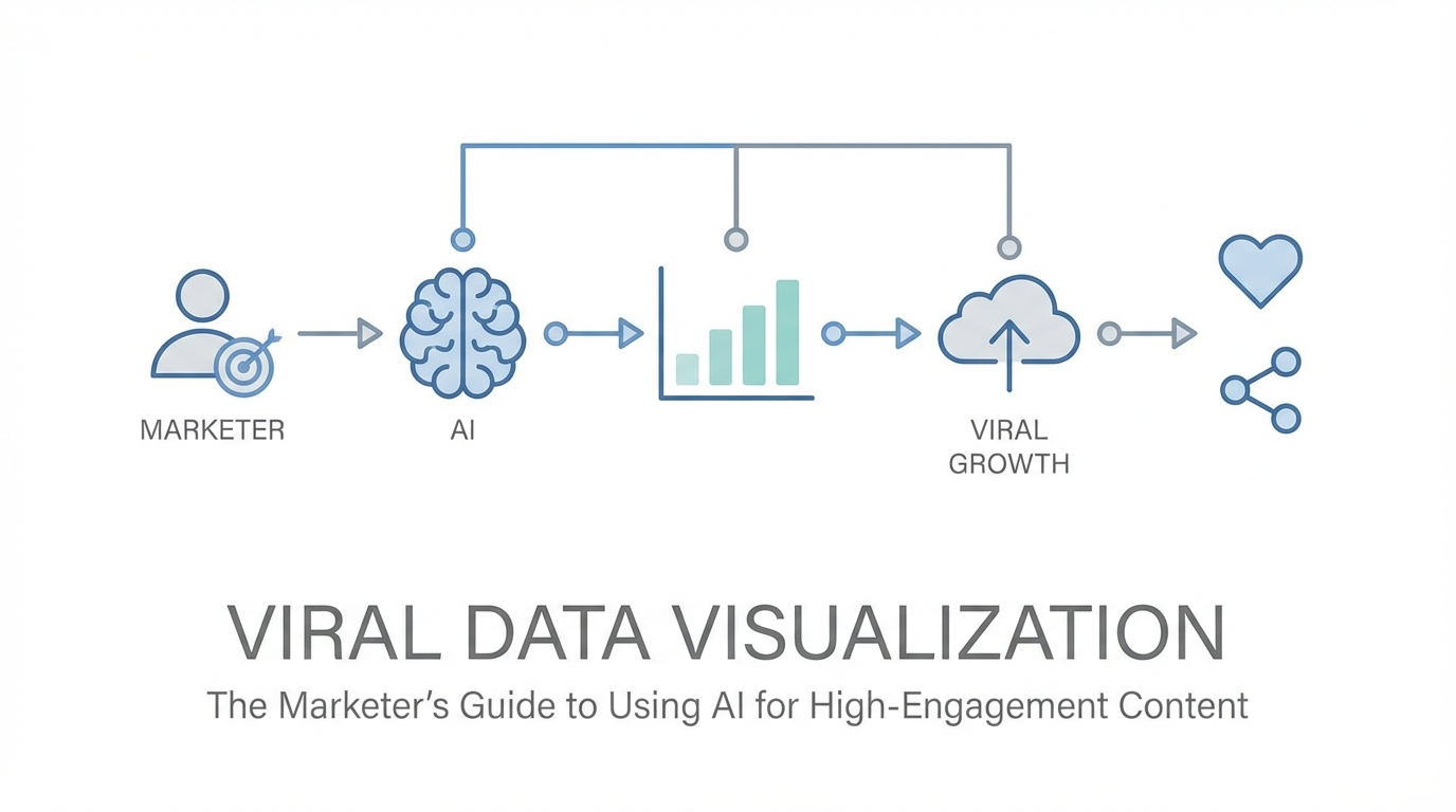
In the high-velocity world of social media, attention is the ultimate currency. Marketers and influencers are constantly battling the algorithm, but the old playbooks are losing their edge. Static bar charts and generic infographics that once dominated LinkedIn and X (formerly Twitter) are now being scrolled past without a second glance. To stop the thumb, you need something more than just information; you need interactive data storytelling that feels alive. This shift from static images to fluid, AI-generated components is redefining how brands communicate authority. By leveraging tools like V0 by Vercel, creators are now transforming unstructured CSVs into high-fidelity, interactive assets that drive massive reach and engagement.
The Death of Standard Charts: Why Static Data is Failing

For years, data visualization for marketing relied on the same tired formats: a blue bar chart from Excel or a colorful pie graph from a stock template. However, as audiences become more sophisticated, these formats have become invisible. Standard charts are dying because they lack the "wow factor" required for the modern feed. According to research on interactive content, visual experiences that allow user participation see significantly higher engagement than static ones. On platforms like X and LinkedIn, users crave visceral, reactive content that they can interact with. A static image is a monologue; a fluid, AI-powered visualization is a conversation.
As Guillermo Rauch, founder of Vercel, points out, the best visualizations are not rigid. They don't just follow the rules of a line chart or a pie chart. They might have elements of navigation, particles that react to touch, or animations that represent the passage of time. When you use AI for social media content, you aren't just making a graph—you are building a micro-experience. This level of depth is what separates a forgettable post from a "banger" tweet that accumulates millions of impressions. Modern marketing requires moving away from the "one size fits all" approach of legacy design tools toward bespoke visual components that tell a specific, urgent story.
Prompting for Virality: Feeding AI the 'Hook'
Creating viral content with AI starts with the input. Many marketers make the mistake of asking AI to "make a cool chart." To achieve virality, you must feed the AI unstructured data—like a raw CSV or a series of Slack messages—and then prompt for the narrative hook. The goal is to find the "significant bit" of information that will resonate with your niche. For example, if you are analyzing influencer analytics, don't just visualize follower growth. Instead, ask the AI to visualize the velocity of engagement during a specific viral window. This creates a more compelling story for your audience.
The secret "sauce" of effective prompting is metaphor and reference. As seen in the recent "vibe coding" movement, explaining your vision in plain English using familiar UI patterns—like Instagram's filters or Apple's sleek hardware aesthetic—allows the AI to bridge the gap between data and design. When you use interactive data storytelling, you are essentially downloading the vision in your head directly into a functional component. This allows for rapid prototyping, where you can move from a raw idea to a shareable link in under fifteen minutes. By focusing on the human-readable story within the numbers, you increase the likelihood of your content being shared across professional networks.
The CSV-to-Component Workflow
- Clean your data: Ensure your CSV contains clear headers and concise values.
- Define the goal: Decide if you want to show growth, comparison, or a timeline.
- Prompt with 'Vibe': Use descriptors like "sleek," "minimalist," "dark mode," or "Apple-inspired."
- Iterate on Mobile: Ensure the UI is mobile-friendly, as over 60% of web traffic occurs on phones.
Case Study: Visualizing 500 Million Downloads for a Banger Tweet
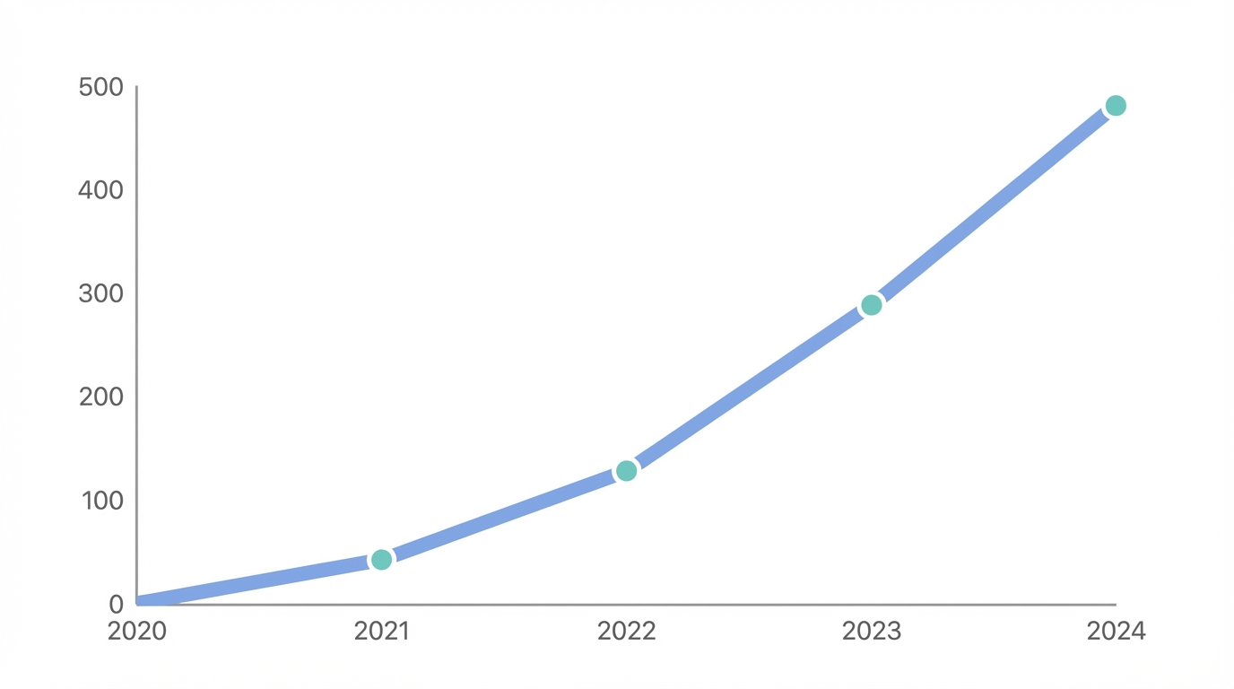
A prime example of viral marketing strategies in action is how Vercel handled the launch of Next.js updates. They wanted to communicate a massive milestone: 500 million downloads. Instead of a simple text announcement or a boring screenshot of a spreadsheet, they used AI to cook up a custom visualization. The prompt focused on the acceleration of growth—highlighting that while it took nine years to reach the first 500 million, the next 500 million happened in just twelve months. This exponential narrative was represented through a high-fidelity, interactive component that users could play with directly in their browsers.
This visualization worked because it followed the principle of "fewer pixels, better UX." By stripping away unnecessary UI and focusing purely on the growth curve, the team created an artifact that was instantly understandable. This post didn't just tell people Next.js was popular; it showed the momentum. For brands looking to replicate this success, using influencer analytics tools to identify which data points their audience cares about most is the first step. Once you have the data, platforms like Stormy AI can help source the right UGC creators to amplify these visualizations, ensuring the content reaches the right developer or marketing circles.
Building Custom Visual Components Over Stock Graphics
One of the biggest advantages of using AI for social media content is the ability to create unique brand assets that cannot be replicated with stock imagery. When you build a component in V0, you aren't just making a picture; you are making code-backed software. This means your data visualization can be live, reactive, and re-evaluated in real-time. Imagine a LinkedIn post where the chart updates as new data comes in, or an X thread where users can toggle different variables to see how it affects the outcome. This level of interactivity creates high-dwell time, which algorithms favor heavily.
Furthermore, these custom assets serve as a marketing machine. Every time someone shares a deployment on a .vercel.app subdomain, it acts as a subtle endorsement of the tech stack used to build it. For brands, this is the "sauce": creating tools so useful or beautiful that the medium becomes the message. By focusing on bespoke components, you move away from the noise of generic content and establish your brand as a leader in interactive data storytelling. This strategy is particularly effective for app install campaigns, where showing a functional "mini-app" version of your data can convert a viewer into a user much faster than a static ad on Meta Ads Manager.
The SEO Benefit of AI Deployments: Leveraging Subdomains
Beyond social engagement, there is a hidden SEO benefit to using AI-powered deployments for data visualization. When you publish a component, you often get a dedicated URL (e.g., project.vercel.app). These URLs are highly crawlable and can be indexed quickly by Google. If your visualization solves a specific search intent—such as "latest TikTok trends visualization"—you can capture organic traffic that traditional blog posts might miss. This is a powerful form of viral marketing strategy that combines the speed of social with the longevity of search.
Additionally, these deployments can be used to test product-market fit. For example, a marketer could deploy a conversational AI form using the Vercel AI SDK to gather user feedback. Unlike a standard Typeform, an AI-native interface can adapt its questions in real-time based on user input, creating a whimsical and specialized intake process. Managing these relationships and tracking the performance of these viral assets is where a dedicated creator CRM excels, offering a way to manage the influencers and developers who interact with your high-engagement content.
The Viral Visualization Playbook: A Step-by-Step Guide

Ready to turn your raw data into a viral asset? Follow this playbook to move from spreadsheet to shareable component using the latest AI tools.
Step 1: Identify Your "Banger" Data Point
Look through your analytics or industry reports for a surprising or exponential trend. Virality often lives in the "gap" between what people expect and what the data actually shows. For instance, find a metric that has doubled in a fraction of the time it previously took to grow.
Step 2: Use Natural Language to Describe the UI
Open an AI tool like V0 and start "vibing." Instead of technical jargon, use descriptive metaphors. For example: "Build me a chart that looks like a liquid glass bubble expanding as the data points increase. It should feel like a premium Apple dashboard with a dark mode aesthetic."
Step 3: Delete the Friction
Follow the "delete, delete, delete" rule. If a button or a link doesn't serve the core story, remove it. Most of your audience will be viewing this on mobile via TikTok or X. Fewer pixels are always better for mobile engagement. Ensure the interactive elements work perfectly with touch gestures.
Step 4: Deploy and Distribute
Publish your component to a live URL. Don't just post a screenshot; post the link. Encourage users to interact with it and share their own findings. This turns your content into a utility, which is the strongest driver of organic reach.
Conclusion: The Future of Data-Driven Marketing
The era of boring, static charts is over. To succeed in the modern attention economy, marketers must embrace AI for social media content and data visualization for marketing as core competencies. By treating every data point as a potential interactive experience, you can build a brand that is not only informative but also visually irresistible. Whether you are visualizing 500 million downloads or the latest influencer trends, the goal is to make the data move.
As you scale your viral efforts, remember that tools like Stormy AI can help you discover and manage the UGC creators who will help spread your visualizations to the masses. The tools are now in your hands to turn complex numbers into simple, beautiful, and viral stories. Stop presenting data and start vibe coding your way to the top of the feed.