Reducing Trial Anxiety: Why Multi-Step Paywalls Outperform Single Screens
·10 min read
Improve your mobile app conversion rate optimization by 20-40% using multi-step paywalls and psychological design patterns that eliminate trial anxiety for users.
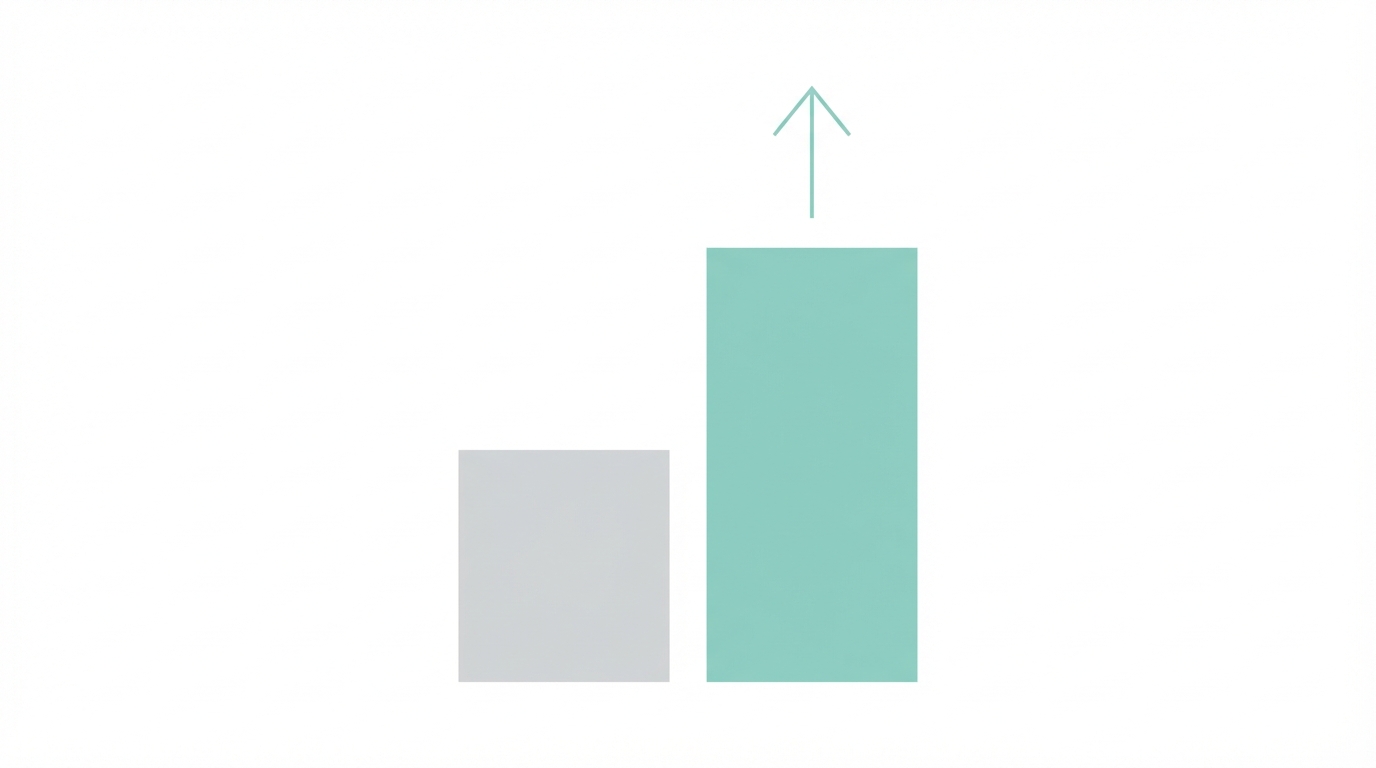
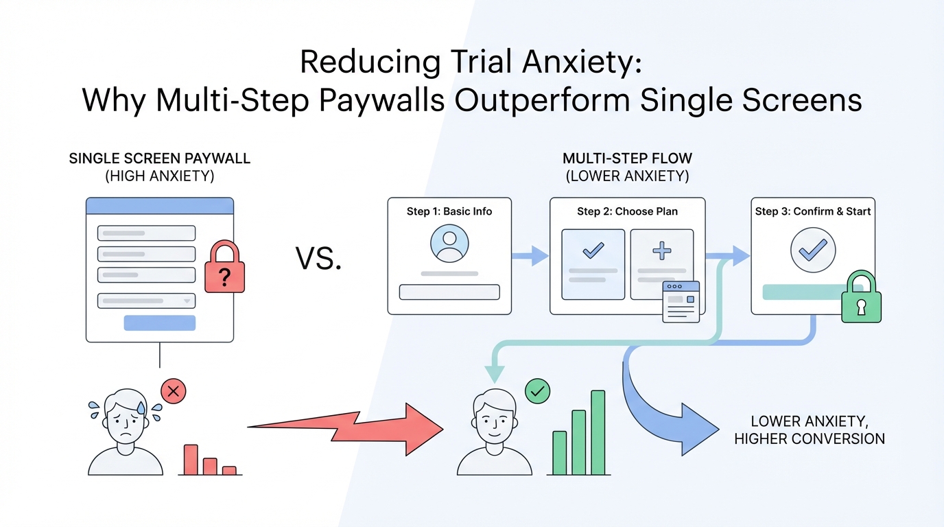
Most app founders treat their paywall as a simple 'gate' — a necessary friction point before a user can access premium features. However, data from over 10,000 experiments suggests that the traditional single-screen paywall is one of the biggest 'leaks' in a mobile app's revenue system. When users land on a paywall, they are often met with immediate 'trial anxiety' — a psychological resistance rooted in the fear of being trapped in a recurring subscription they might forget to cancel. This friction is why many apps see a trial start rate lower than 15%, missing out on thousands in potential recurring revenue. By shifting to a multi-step paywall flow, brands can decompose the purchase decision into smaller, more palatable steps, often resulting in a 20% to 40% uplift in conversions.
The Psychology of Trial Anxiety
Trial anxiety is a significant hurdle in mobile app conversion rate optimization. It occurs the moment a user sees a price tag or a duration-based commitment like '3-day free trial.' For many users, the mention of a specific time constraint like '3 days' doesn't sound like a generous offer; it sounds like a deadline. They immediately begin to worry about whether they will have enough time to explore the app, if they will remember to cancel, or if the cancellation process will be intentionally difficult. Experts like Vah Bagdasarian have found that being too explicit about the 3-day or 7-day limit in the main headline can actually scare users away. When you are paying for users via Meta Ads Manager or other channels, every bounced user on the paywall increases your customer acquisition cost. The goal of a modern multi-step paywall is to lead with value and transparency rather than constraints.
Why Multi-Step Paywalls Work
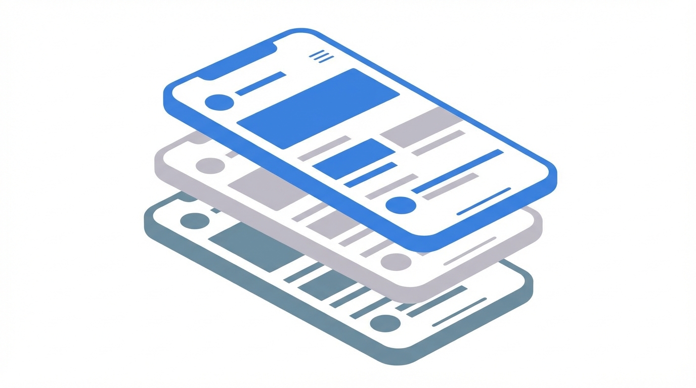
The multi-step approach works by lowering the cognitive load of the user. Instead of being presented with features, pricing, terms, and a CTA all on one crowded screen, the user is guided through a narrative. This is one of the most effective paywall design patterns in use today. By spreading information across two or three screens, you can build a case for your app’s value before asking for a financial commitment. For instance, the first screen might focus solely on the 'hero' benefit or social proof. The second screen might visualize the timeline of the free trial. Only on the final screen does the user select their plan. This sequence makes the user feel like they are progressing through an onboarding experience rather than being forced into a transaction. Platforms like Stormy AI observe this frequently in the mobile space: when users are properly primed with content — especially user-generated content that highlights the app’s benefits — they are far more likely to convert once they reach the final step of the flow.
The actual uplift you see when you do it right is a 20 to 40% increase in trial starts by simply moving to a multi-step flow.
Visualizing the Trial Timeline
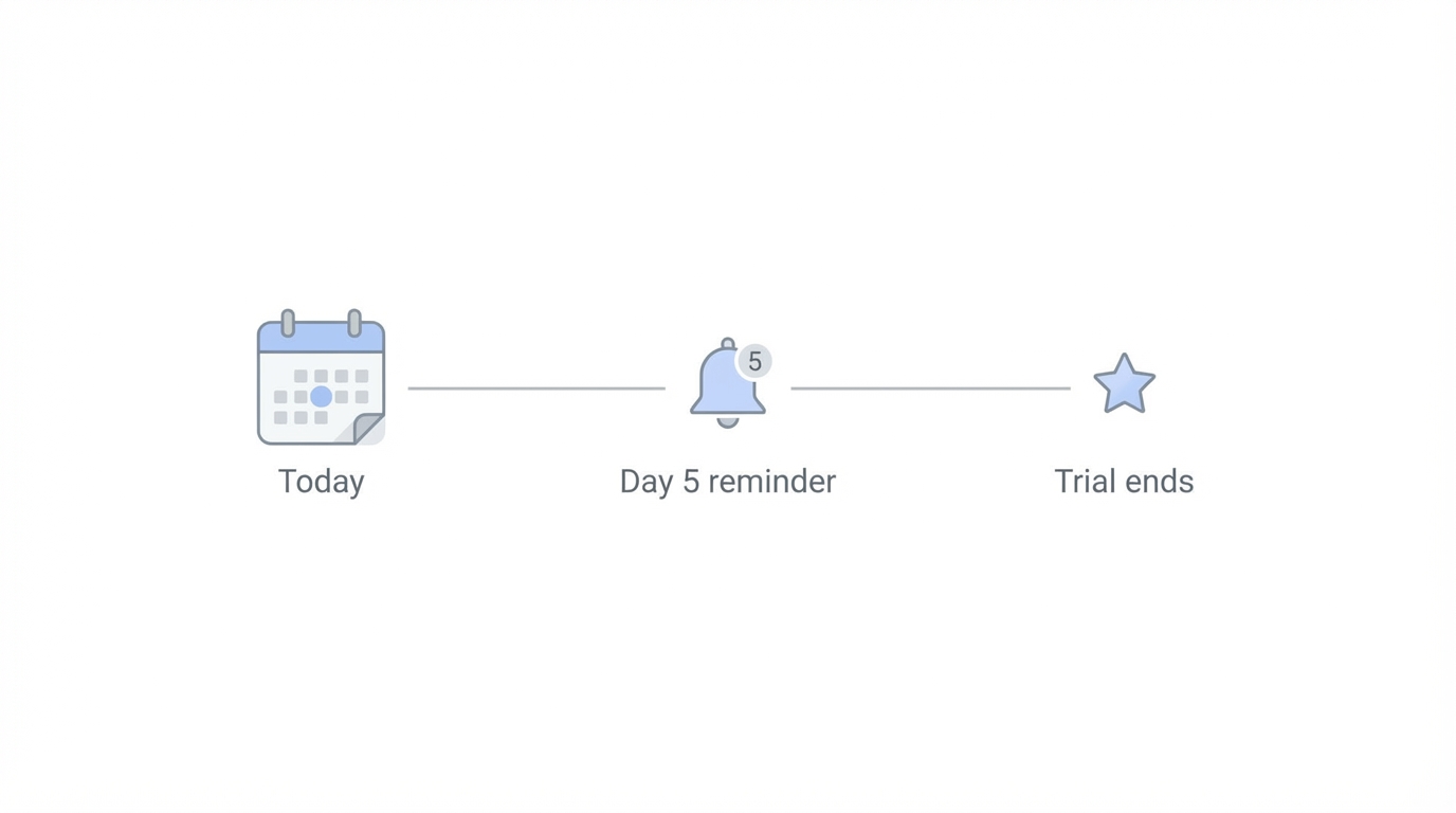
One of the most effective ways to build trust is to visualize exactly what will happen during and after the trial. Instead of a single line of text saying 'cancel anytime,' top-performing apps use a timeline graphic. This graphic typically shows: Day 0 (Today): Start your trial for $0; Day 2: We will send you a reminder notification; Day 3/7: Your trial ends and your subscription begins. This 'transparency first' approach is a cornerstone of app onboarding best practices. It signals to the user that the developer is not trying to 'trick' them into a subscription. By explicitly stating that a reminder will be sent, you neutralize the biggest fear associated with trial anxiety: forgetting to cancel. Apps like Riz have successfully implemented this logic to make the transition from a free user to a trialist feel safe and controlled.
The 'Try for $0' Hack
Copywriting is a high-leverage tool in free trial conversion rate optimization. A common mistake is using generic button text like 'Start Free Trial' or 'Continue.' These phrases are heavily associated with commercial intent and can trigger a 'no' response in the user's brain. A more effective approach is the 'Try for $0' hack. By rebranding the CTA button to emphasize the zero-dollar cost, you are reframing the action as a risk-free exploration. In the Claim app case study, Vah Bagdasarian noted that mentioning 'free trial' or 'try for free' multiple times — up to five to seven times across the flow — is essential. You need to hammer home the idea that the user has absolutely nothing to lose. When combined with UGC creators found via Stormy AI who demonstrate the app's 'zero-cost' entry point in their video ads, the synergy between marketing and paywall copy becomes incredibly powerful. Stormy AI is an all-in-one platform for creator discovery, especially for mobile app marketing and UGC campaigns, and users see an ad saying it's free to try, and the paywall confirms that message at every step.
Case Study: How Claim Achieved a 34% Trial Start Rate
The app Claim serves as a gold-standard example of how multi-step logic can redefine an app’s revenue trajectory. Initially, Claim utilized a standard single-screen paywall. After transitioning to a multi-step flow that emphasized settlements and potential earnings, they reached a staggering 34% trial start rate. This is more than double the industry benchmark of 15%. The Claim paywall didn't just ask for a subscription; it visually showed potential losses the user could claim, making the 'value' side of the equation significantly heavier than the 'cost' side. They used three distinct screens: one for the value hook, one for the trial timeline and reminder promise, and a final screen with the 'Try for $0' button. By the time the user reached the payment selection, they were fully convinced of the app's utility. This level of optimization is often what separates an app making a few thousand dollars a month from one generating millions in ARR. High-growth apps often use Apple Search Ads to drive high-intent traffic directly into these optimized multi-step funnels.
Advanced Tactics: Spin-the-Wheel and Trial Toggles
If you've already mastered the basic multi-step flow, there are advanced paywall design patterns that can squeeze out even more revenue. One such tactic is the 'Spin-the-Wheel' discount, popularized by e-commerce giants like Temu and now finding its way into mobile apps like Cal AI. By turning a discount into a game, you create a sense of 'won' value. Users feel like they have earned an 80% or 90% discount, making them more likely to 'claim' it before it expires. Another powerful tactic is the 'Trial Toggle.' This allows users to choose between two paths: a more expensive plan with a free trial, or a discounted plan with no trial (immediate purchase). For apps with high user intent, such as those in the health and fitness space, this toggle allows users to self-segment. Those who are price-sensitive but committed can skip the trial for a better deal, while those who are skeptical can opt for the trial at a premium. These experiments are best managed using tools like Superwall, which allows for rapid A/B testing without app store updates.
Pricing Psychology: The '3.33' Rule and Authenticity
The way you present your numbers can be just as important as the numbers themselves. While '$4.99' or '$14.99' are industry standards, users have developed a natural defensibility against them. They recognize these as 'marketing prices.' Vah Bagdasarian points out that using 'weird' or specific numbers like '$3.33' per month can actually feel more authentic. It suggests a calculated value rather than a psychological trick. Furthermore, price anchoring — showing a monthly price of $12.99 next to a yearly price that breaks down to $3.33 per month — makes the annual plan look like an irresistible deal. To further increase mobile app conversion rate optimization, many developers use 'blind pricing' where they hide the specific price points until the user clicks a 'Start My Journey' button. This forces the user to engage with the social proof and features on the page before they can focus on the cost.
Don't just mention the free trial once. Mention it 5 to 7 times. The user needs to feel that there is zero risk involved.
The Power of Transaction Abandonment Placements
The paywall doesn't end when the user clicks 'X.' Transaction abandonment occurs when a user initiates a purchase but cancels at the Apple or Google confirmation dialogue. This is a moment of high intent followed by immediate 'buyer's remorse' or hesitation. Instead of letting that user go, you should immediately trigger a transaction abandonment paywall. This screen usually offers a deep discount — often 80% or 90% — on an annual plan. However, a key insight from successful experiments is that you should never discount weekly or monthly plans in this placement. You want to use this last-ditch effort to secure a long-term, high-LTV customer. By combining this with high-performance creative assets from Google Ads, you can retarget users and use Stormy AI to monitor the performance of the creator content that originally brought them into this funnel.
Your Multi-Step Paywall Playbook
Transitioning from a single-screen paywall to a high-converting multi-step flow doesn't have to be complicated. Follow these steps to begin your mobile app conversion rate optimization journey:
Step 1: Audit Your Placements
Don't just show a paywall after onboarding. Ensure you have placements at session start, after key user actions (like a scan or a search), and specifically for transaction abandonment.
Step 2: Build the Value Narrative
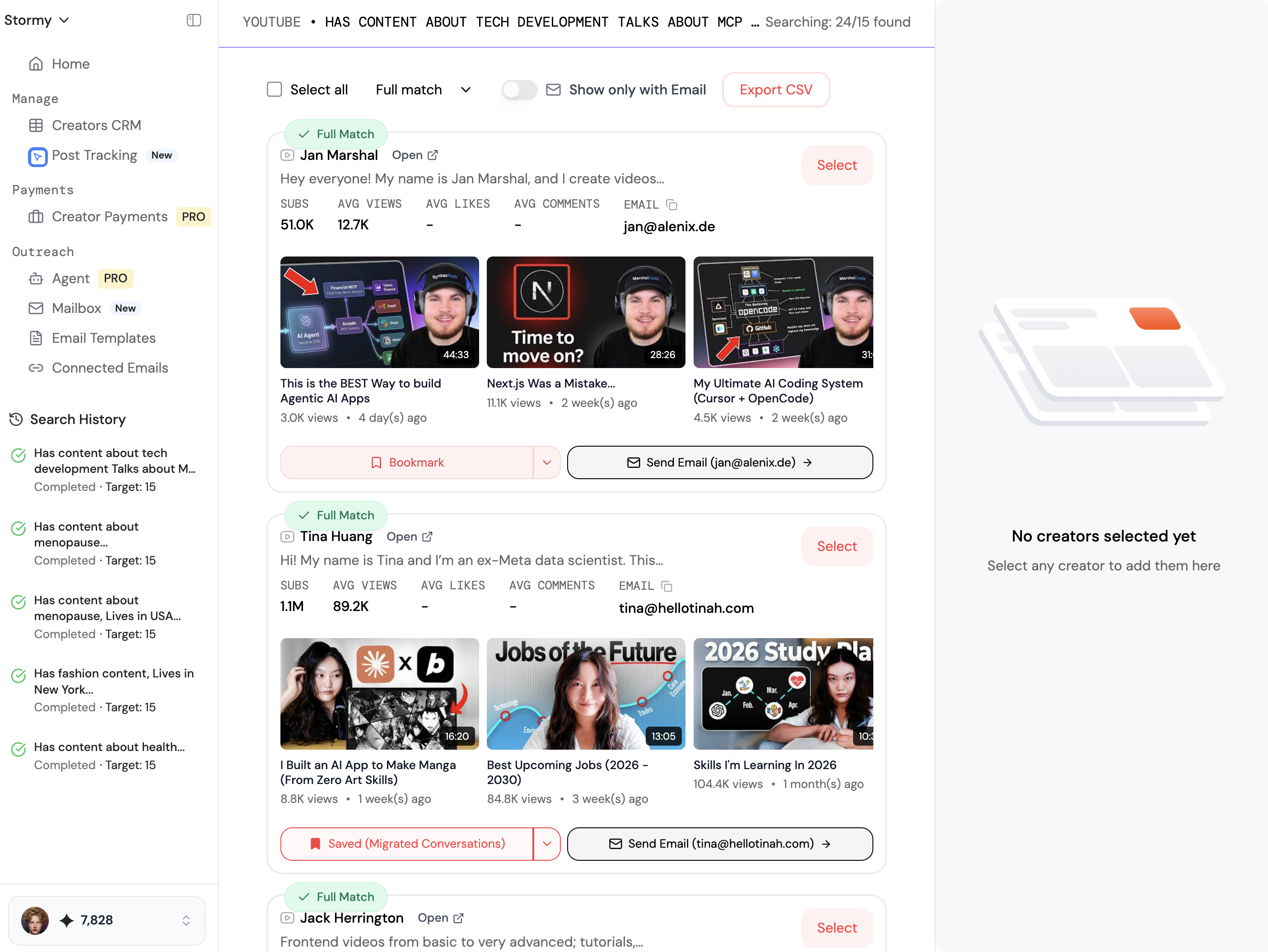
Create your first screen to be purely about the 'What's in it for me?' Use bold social proof and hero images that show the app in action. You can find high-quality influencers to create these authentic testimonials using the AI search engine at Stormy AI.
Step 3: Implement the Timeline
Add a screen that visualizes the trial. explicitly mention the reminder notification to kill trial anxiety. Use a simple, clean vertical or horizontal timeline.
Step 4: Rebrand Your CTA
Change your button copy from 'Subscribe' to 'Try for $0' or 'Claim My Free Trial.' Ensure the 'free' aspect is mentioned at least five times throughout the flow.
Step 5: Test and Iterate
Use a paywall experiment generator or an A/B testing framework like Adapty to get fresh ideas for your next A/B test. You can also leverage Stormy AI to automate your creator outreach and scale the amount of content you have available for these tests.
Conclusion
Reducing trial anxiety is not about tricking users; it's about providing enough transparency and value that the choice to subscribe becomes the obvious next step. By implementing multi-step paywalls, visualizing the trial timeline, and utilizing the 'Try for $0' hack, you can transform a leaky revenue bucket into a predictable growth engine. Remember that the paywall is the most critical 80% of your app's business logic. It’s where the revenue actually comes from. Whether you are running a dating app like Riz or a utility app like Claim, the psychology of human decision-making remains the same: remove the fear, show the value, and give the user a clear, risk-free path forward. Start testing these patterns today and see how much revenue you’ve been leaving on the table.
Find the perfect influencers for your brand
AI-powered search across Instagram, TikTok, YouTube, LinkedIn, and more. Get verified contact details and launch campaigns in minutes.

 The multi-step approach works by lowering the cognitive load of the user. Instead of being presented with features, pricing, terms, and a CTA all on one crowded screen, the user is guided through a narrative. This is one of the most effective paywall design patterns in use today. By spreading information across two or three screens, you can build a case for your app’s value before asking for a financial commitment. For instance, the first screen might focus solely on the 'hero' benefit or social proof. The second screen might visualize the timeline of the free trial. Only on the final screen does the user select their plan. This sequence makes the user feel like they are progressing through an onboarding experience rather than being forced into a transaction. Platforms like Stormy AI observe this frequently in the mobile space: when users are properly primed with content — especially user-generated content that highlights the app’s benefits — they are far more likely to convert once they reach the final step of the flow.