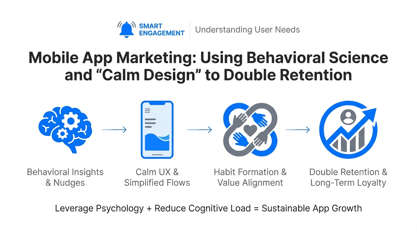
In an era where building a functional prototype is no longer a barrier to entry, the real battleground for mobile app success has shifted from development to retention. We are entering the age of "vibe coding," where a first-time founder can stand up a functional app in three hours using tools like Claude and Cursor. However, the ease of creation has led to a saturated market where user engagement tactics are the only thing separating million-dollar businesses from forgotten icons on a home screen. To survive, developers must look beyond code and embrace behavioral design for marketing.
By applying consumer psychology and familiar UI patterns—such as the narrative flow of Instagram Stories—to utility apps, founders are seeing dramatic shifts in user sentiment. The goal is no longer just to provide a utility, but to build an "intelligent partner." This involves shifting from static, overwhelming dashboards to what experts call "Calm Design," a philosophy that prioritizes mobile user experience growth through emotional resonance and reduced cognitive load.
Progressive Disclosure: The Death of the Dashboard
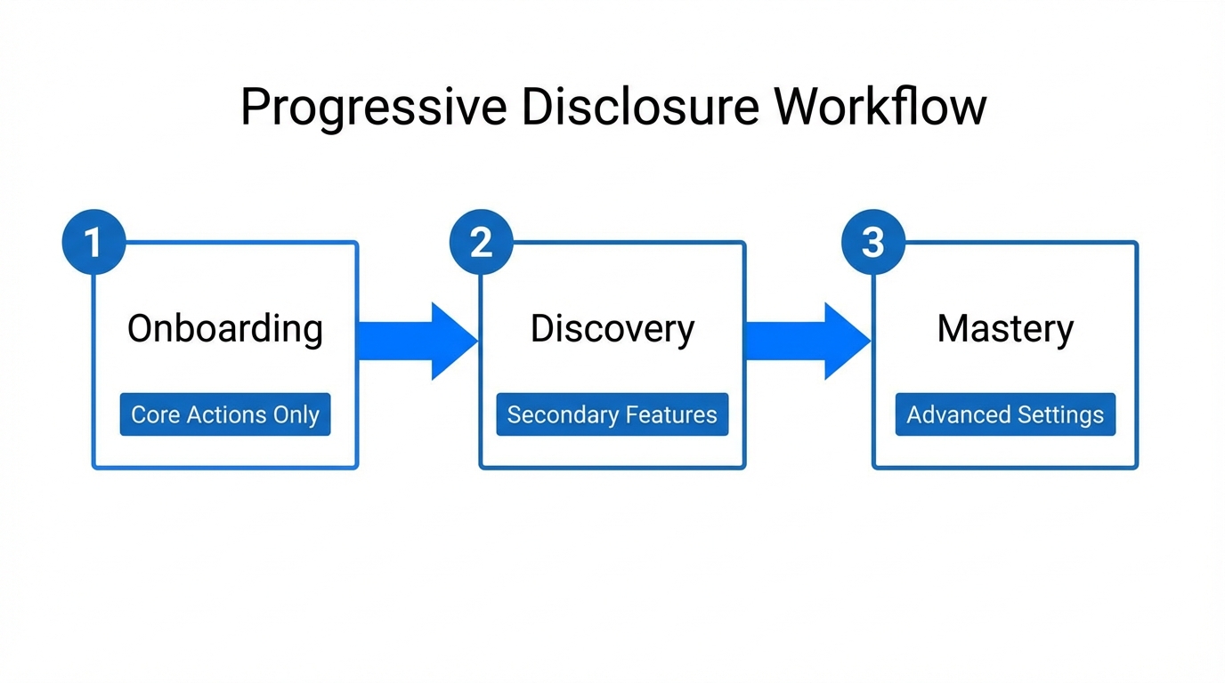
One of the most significant app retention strategies involves a concept known as progressive disclosure. Traditional apps, especially in the finance or health sectors, often suffer from "dashboard fatigue." They present every piece of data at once—spending charts, investment balances, savings goals, and budget alerts—all competing for the user's limited executive function. Research from the American Psychological Association suggests that when a user is presented with too much information, they experience context-switching fatigue, leading them to close the app to avoid the stress of processing it.
Instead of a "Frankenstein dashboard" with twelve different colors and sinky charts, successful apps are moving toward a card-based system. This approach follows the logic of Large Language Models (LLMs); just as AI processes information better in tokens, humans process information better when it is "chunked." By focusing on a single question—such as "How much did I spend on food today?"—the app allows the user to step through their problems without getting distracted. Using a tool like Notion to organize these design sprints can help teams stay focused on the "one screen, one purpose" rule.
"The hard part of building an app today isn't the software; it's the insights you generate from your target audience to reduce their mental friction."The Instagram Story Model: Narrative Over Static Data
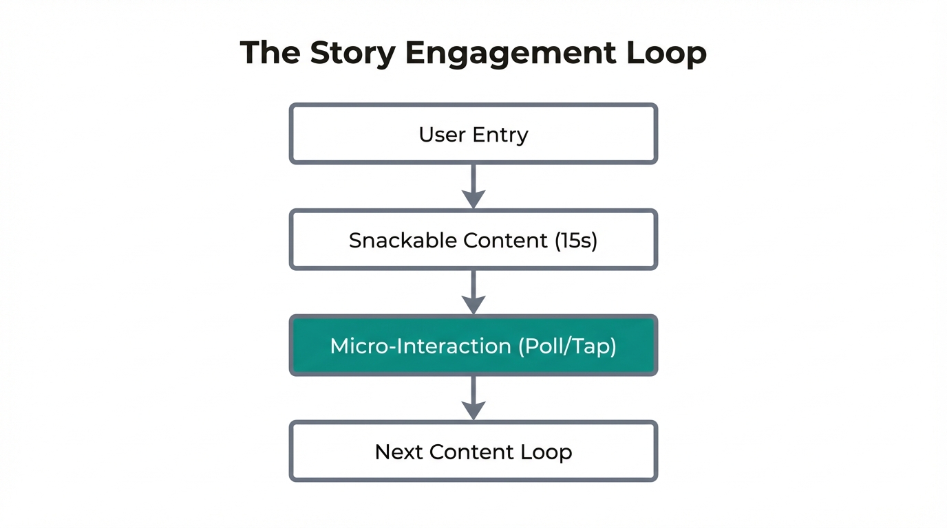
Why do users spend hours scrolling through Instagram but feel a sense of dread when opening a banking app? The answer lies in the delivery format. Instagram utilizes a narrative-driven "story" model that feels ephemeral, low-stakes, and easy to consume. Forward-thinking apps are now borrowing this UX pattern to drive mobile user experience growth.
By replacing static lists with daily "check-ins" that look and feel like stories, apps can transform chores into habits. For instance, the finance app Peak replaced its old-school data tables with circular icons at the top of the screen—identical to the Instagram Story UI. When a user taps them, they are taken through a narrative summary of their day. This uses the Gestalt principle of organized information and storytelling, making the data feel narratively relevant to the individual user.
| Feature | Traditional Dashboard | Narrative Story Model |
|---|---|---|
| Data Density | High (Overwhelming) | Low (Bite-sized) |
| User Sentiment | Anxious/Stressful | Calm/Engaging |
| Retention Driver | Utility only | Daily Habit/Curiosity |
| Interaction Type | Search & Filter | Guided Narrative |
Calm Design: Winning in 'Scary' Categories
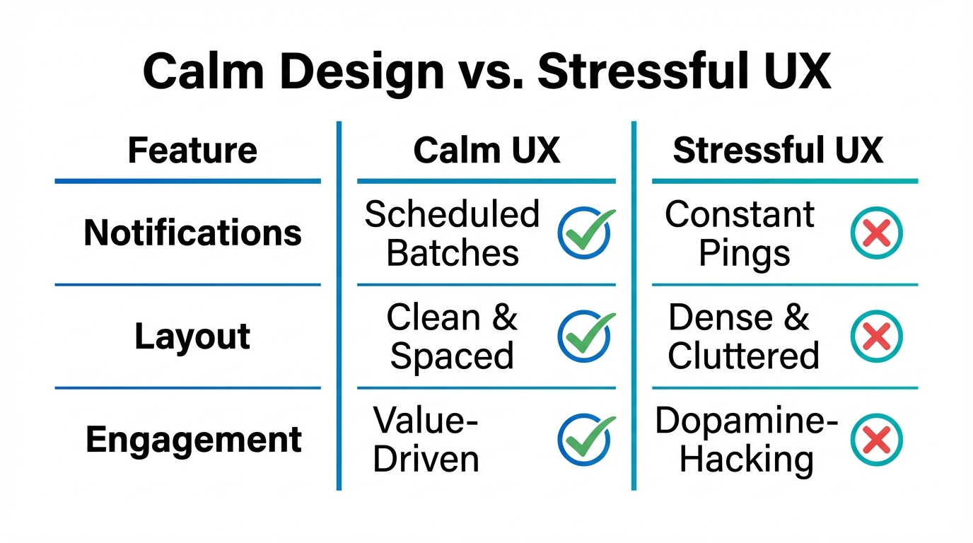
Consumer psychology in apps reveals that many users avoid "serious" apps (finance, health, productivity) because the interfaces feel judgmental. Red numbers, bold warning signs, and aggressive alerts trigger a stress response. Calm Design flips this script by using friendly, non-judgmental interfaces that make the user feel supported rather than monitored.
Apps that utilize pastel colors, rounded icons, and encouraging language—often modeled after wellness apps like Calm—perform significantly better in high-stress categories. Users report being able to "open the app more often" because it doesn't feel scary. In one case study, a simple shift from a corporate design to a "fun and intelligent" brand helped a finance app reach thousands of downloads within its first month. The UI became an invitation rather than a reprimand.
"People don't want soulless, black-and-white brands anymore. They want a smart friend who has their back, not a digital accountant who points fingers."Context-Specific Notifications: Timing the Return
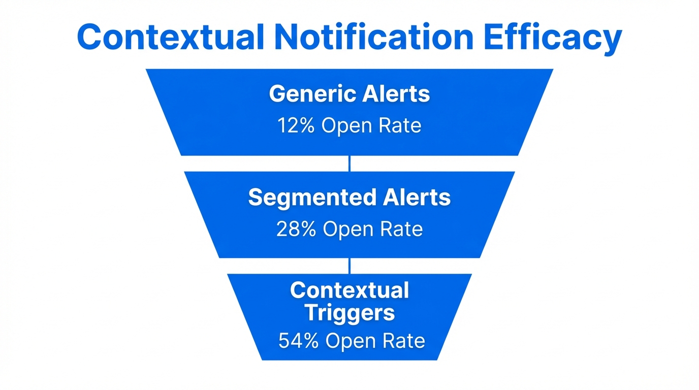
Generic notifications are the fastest way to get an app deleted. To double retention, developers must implement context-specific notifications based on timing and personalized triggers. AI-powered apps can analyze a user's behavior to determine the exact moment a nudge will be helpful rather than annoying.
For example, instead of a daily 9:00 AM ping, an app might send a notification on Friday evening about "weekend spend buckets" or a Monday morning summary that prepares the user for the week ahead. When one startup implemented context-specific reminders, they saw their week-three retention jump from 13% to 28% in just a few days. Pairing these insights with a marketing automation tool like Klaviyo or Braze allows for sophisticated, behavior-based messaging that feels like a concierge service.
Building an 'Intelligent Partner' Through Emotional Resonance
The ultimate goal of user engagement tactics in the AI era is to create emotional resonance. This is achieved by giving the software a "memory." By utilizing vector databases, apps can store thousands of small signals about a user—such as their values, their family situation, or their specific goals—and use that context in future interactions.
If an app remembers that you value fitness and doesn't scold you for a high spend at the gym, it builds trust. It shifts from being a piece of software to being an intelligent partner. This human-like interaction is what modern consumers expect. They want an interface that functions like a "smarter best friend" who has spent a year studying their specific needs. To manage the complex relationships and creators needed to promote such an app, platforms like Stormy AI can help source and manage UGC creators who can authentically communicate these "partner" benefits to a wider audience.
The Build-in-Public Playbook for App Growth
Marketing an app today requires more than just Meta Ads. The most successful founders are "building in public" on platforms like X (formerly Twitter). By sharing the journey—including the bugs, the retention struggles, and the small wins—founders build a community of advocates before the app even hits the store.
One highly effective tactic is "tweet jacking"—finding a viral complaint about a competitor's complex UI and replying with a screenshot of your simplified, Calm Design alternative. This humanizes the brand and provides an immediate solution to a high-intent audience. Additionally, using AI tools like ChatGPT to generate memes around industry pain points can drive thousands of organic impressions. When you are ready to scale this outreach, using AI-powered creator discovery platforms like Stormy AI allows you to find influencers who already have the trust of your target demographic, ensuring your "vibe-coded" app gets the attention it deserves.
Conclusion: The Future of Mobile Engagement
The technical barrier to building apps has vanished, but the psychological barrier to keeping users has never been higher. To double retention, you must move beyond the feature set and focus on the behavioral design for marketing. This means embracing progressive disclosure, adopting narrative-driven UI, and ensuring your app feels like a calm, intelligent partner rather than a stressful tool.
By combining these behavioral principles with a dedicated build-in-public strategy, you can turn a simple prototype into a high-retention powerhouse. Start by talking to your "six users," simplify your interface until it feels like a conversation, and use AI—both in your code and in your marketing—to build a brand that resonates on an emotional level. The golden age of AI-native mobile apps is here; the winners will be those who design for the human brain, not just the mobile screen.