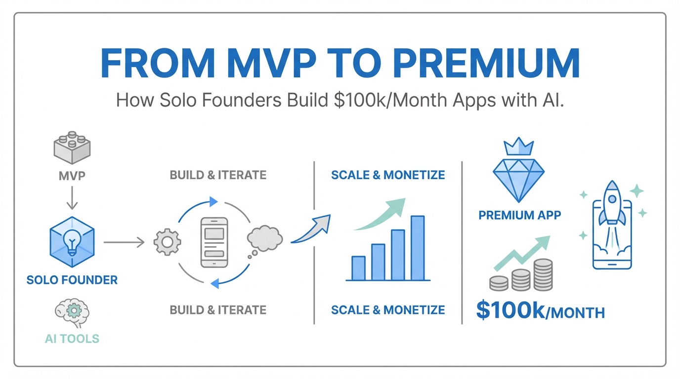
We are officially entering the era of the "idea guy." As Sam Altman, co-founder of OpenAI, recently noted, the barrier to building complex software has collapsed. But this ease of creation has birthed a new problem: a sea of "vibe-coded" apps that look, feel, and function like 24-hour experiments. To move from a hobbyist project to a cash-flowing portfolio asset generating $50k to $100k per month, according to Indie Hackers revenue data, solo founders must bridge the gap between a functional MVP and a premium experience. This transition isn't just about code—it is about premium app design, motion, and psychological triggers that justify high subscription prices in a hyper-competitive market.
The App Store Screenshot Rule: The Funnel Starts Here
In the world of solo developer apps, your most important asset is not your backend; it’s your "title and thumbnail." For mobile developers, this means your app store optimization screenshots. Most developers spend months on features and minutes on their store listing. This is a fatal mistake in mobile app monetization. If a user doesn't click, your features don't exist.
Think of your screenshots as a movie trailer. They need to convey high production value instantly. A great resource for this is the Screenshot First Company, which curates elite-tier app store designs. High-performing apps like Chris Vuroke’s Amy or Luna use screenshots to signal quality before the download button is ever pressed. To compete, your screenshots shouldn't just show the app; they should showcase the premium feel through depth, shadows, and clean typography. If your screenshots look like generic templates, users will assume your app provides generic value.
The Design Inspiration Stack: Where to Look
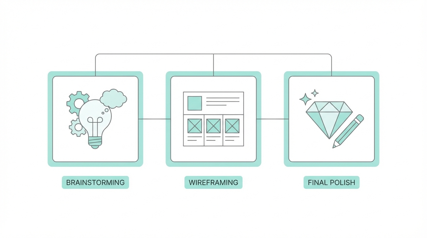
For non-designers, the hardest part of building a premium app design is knowing what "good" looks like. You cannot design in a vacuum. You need to be constantly exposed to elite-tier mobile interfaces to level up your internal design sense. The SaaS design inspiration stack used by top founders includes three critical resources:
- Mobbin: A massive library of real-world app screenshots. Use it to see how apps like Duolingo or Airbnb handle specific UI patterns.
- 60fps: This site focuses specifically on interactions and animations. If you want to see how a button should bounce or a page should slide, this is the gold standard.
- Spotted in Prod: This platform highlights the latest design trends and "Easter eggs" found in top-tier production apps.
By studying these resources, you move away from standard AI-generated layouts and toward a bespoke feel. For example, instead of an instant page transition, you might use Claude to prompt a subtle bounce or a horizontal swipe, making the app feel more fluid and expensive.
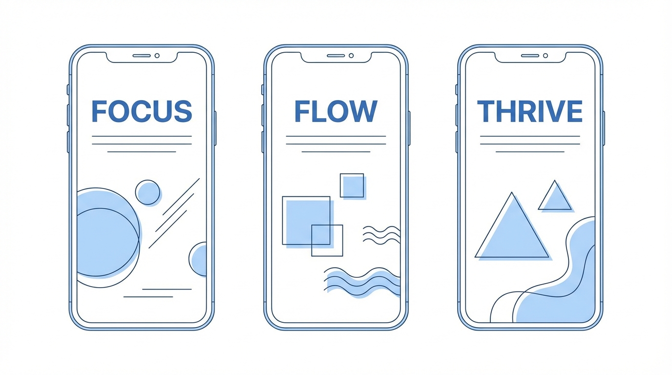
The 10x Design Framework: From Static to Dynamic
The difference between a $10/year app and a $100/year app is often perceived value. Static apps feel cheap. Dynamic apps feel premium. The 10x Design Framework focuses on three pillars of motion:
1. Animations and Interactions
Consumers can now spot a "vibe-coded" app from a mile away. These apps are often static and lack "life." To combat this, founders are using AI tools like Claude to write SwiftUI animations. Subtle details—like a microphone icon expanding into a black background or pages that slide and bounce—create an emotional connection. These small touches signal to the user that a human (or a very thoughtful AI) spent time on the details.
2. The Mascot Revolution
Adding a mascot—like Lily the Ghost or Amy the Cat—gives your app a face. Using ChatGPT with a reference image (perhaps a hand-drawn sketch) allows you to generate infinite iterations of your mascot for different app states, such as empty search results or successful habit completions.
3. Animated Assets
Static mascots are good; animated mascots are better. A pro tip for solo developers is using Midjourney to animate static characters. By feeding a mascot into Midjourney as a starting frame, you can create looping animations that make your login or splash screens feel incredibly high-end.
Onboarding as an Experience: Why Users Sign Up Twice
Onboarding is usually a chore users want to skip. However, premium apps treat onboarding as a feature. By incorporating custom illustrations, animated progress bars, and high-fidelity transitions, you can turn the setup process into a moment of delight. Some users have been known to sign up for apps like Amy twice just to experience the onboarding animation again.
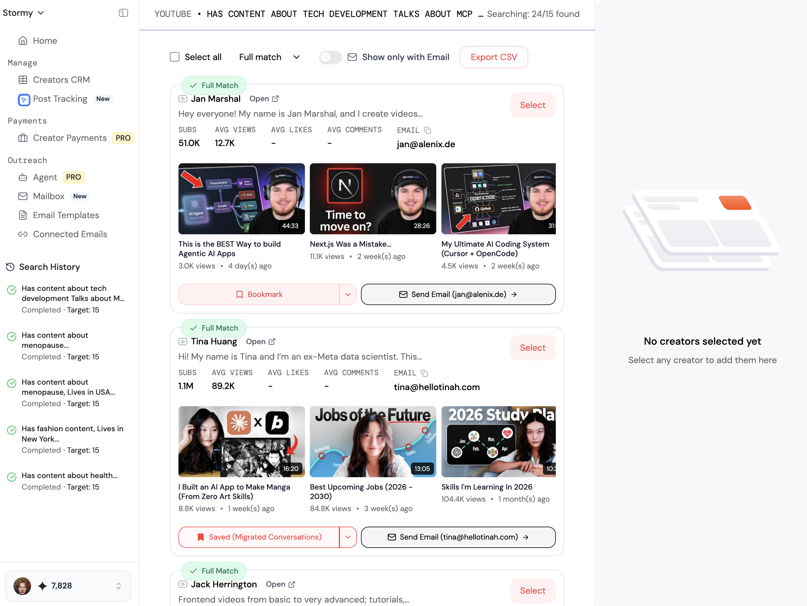
When scaling these premium apps, savvy founders often turn to Stormy AI to discover creators who can showcase these high-fidelity interactions through UGC (User-Generated Content). High-quality video reviews that highlight smooth animations and clever mascots are significantly more effective at driving app installs than static ads. Tools like Stormy help you manage these creator relationships and track post-performance as your app grows.
Widgets: The Ultimate Retention Cheat Code
If you want to solve the retention problem in mobile app monetization, you need to occupy real estate on the user’s home screen. With modern AI coding assistants, building a widget has gone from a week-long task to a four-hour afternoon project.
Lock screen widgets are the "ultimate cheat code." There are only four slots available on a user's lock screen. If you can earn one of those spots, your app is seen up to 150 times a day. This constant visibility is a retention powerhouse, reminding the user to log their calories, check their tasks, or track their budget without them ever having to open the App Store. Apps like Locket and Luvvy have mastered this ecosystem, and solo developers should prioritize widget development early in their roadmap.
Resource Guide: Iconography and Typography
Consistency is the hallmark of professional software. Mixing lined icons with filled icons is a telltale sign of an amateur build. To ensure your app maintains its premium app design, stick to a single, high-quality icon set. Here are the best resources for solo builders:
- Hero Icons: A free, high-quality set of icons that are perfect for clean, modern interfaces.
- Font Awesome: The industry standard for variety and reliability.
- Nucleo: A powerful application and icon library that helps you manage and customize icon sets for your specific brand.
Similarly, do not ignore typography. Spend time researching font weights and readability. A simple shift from a default system font to a carefully chosen typeface can transform the entire "vibe" of a SaaS product.
Conclusion: Building for the Long Haul
Building a $100k/month app as a solo founder is no longer a pipe dream—it is a design challenge. By moving past the "vibe-coding" phase and investing in premium app design, sophisticated animations, and home-screen real estate via widgets, you create an asset that users are happy to pay for. Leverage tools like CreateAnything or Claude to handle the technical heavy lifting, but keep your focus on the polish. The market is crowded, but there is always room at the top for apps that don't just work—they shine.