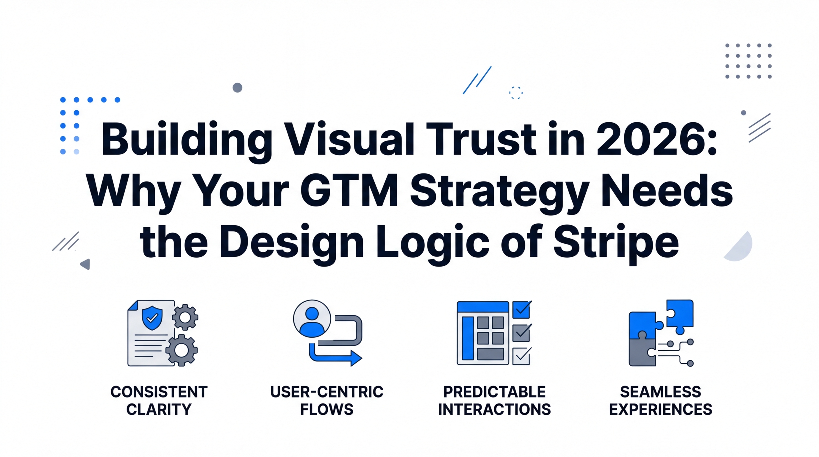
In the digital landscape of 2026, the barrier to entry for building a functional software product has effectively vanished. With AI agents capable of generating codebases and marketing copy in seconds, the technical 'how' is no longer the differentiator. Instead, the ultimate moat has shifted to something far more elusive: Taste. First impressions now happen in milliseconds, and for Go-To-Market (GTM) teams, those milliseconds determine whether a prospect stays to convert or bounces in a fit of skepticism. This article explores why your brand needs the design logic of companies like Stripe to establish instant authority in a world of AI-generated noise.
The Psychology of Trust: Why 'Premium' Beats Copy
Exploring the connection between aesthetic choices and building immediate visual trust with users.
Before a lead reads a single word of your value proposition, their brain has already conducted a visual audit. This is the psychology of visual trust. We are naturally drawn to things that feel 'special,' even if we cannot immediately articulate why. According to David Marks, author of Status and Culture, good taste requires two things: proposing an identity that matters to a valued community and using lifestyle choices to authentically communicate that identity.
For a SaaS brand in 2026, this means your website isn't just a container for information; it is a signal of competence. If your landing page looks cluttered, dated, or overly 'templatey,' the user subconsciously assumes your product is equally unrefined. Conversely, when a site feels premium, it lowers the perceived risk of the purchase. This is the foundation of Meta Ads performance—your creative assets must look like they belong in the future, not a legacy archive.
Deconstructing the 'Stripe Aesthetic': Neutrality and the Swiss School
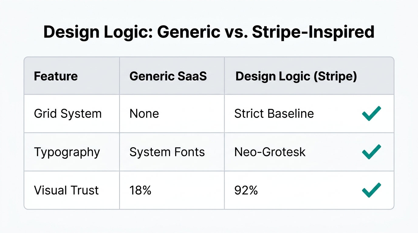
When marketers talk about 'the Stripe look,' they are usually referring to a specific lineage of design that dates back to 1919 Germany. It started with Walter Gropius and the Bauhaus school. Gropius was an architect who sought to strip away the ornamental, Victorian excesses of the past, focusing instead on 'reducing everything to its essentials.' This 'less is more' philosophy was later refined by the legendary German designer Dieter Rams at Braun.
Rams' creation, the T3 radio, was an object of pure utility and beauty. It was this exact radio that inspired Steve Jobs and Jony Ive when they designed the original iPod. They weren't just making a gadget; they were practicing 'Good Taste' by studying the rules of the past. Today, Stripe carries this torch by utilizing the Swiss school of thought—a style rooted in neutrality and universal accessibility. The Swiss believed that design should be so clear that anyone, regardless of language, could navigate it.
"The goal of modern design is not to be different, but to be better. Neutrality is the ultimate form of sophistication because it allows the user's needs to take center stage."| Design Element | Legacy GTM Approach | 2026 'Good Taste' Approach |
|---|---|---|
| Spacing | Crammed, high-density | Generous whitespace (breathability) |
| Typography | Standard system fonts | Neutral sans-serifs (e.g., Helvetica derivatives) |
| Color | Aggressive, neon CTA buttons | Functional palettes with purposeful highlights |
| Layout | Grid-breaking 'chaos' | Strict adherence to visual hierarchy |
Applying the 'Rule of Thirds' to Modern Landing Pages
How historical context and post-war constraints shaped the evolution of modern design logic.To move from a 'functional' site to a 'tasteful' one, you must embrace constraints. In fashion, there is a concept called the Rule of Thirds—for example, a sports jacket should ideally end at the wearer's thumb to maintain perfect proportions. This isn't a random trend; it’s a rule rooted in centuries of British tailoring that creates a silhouette the human eye finds pleasing.
In 2026, the same logic applies to high converting landing pages. Your hero section, your feature blocks, and your testimonials should follow mathematical ratios. By using Figma to audit your GTM assets against these historical constraints, you can ensure your layout feels 'right' before you even add images. This structural integrity is what separates a professional GTM visual strategy from a cluttered mess.
A Step-by-Step Audit: Developing 'Good Taste' in Your GTM Assets
A comprehensive breakdown of the four steps required to develop professional-level taste.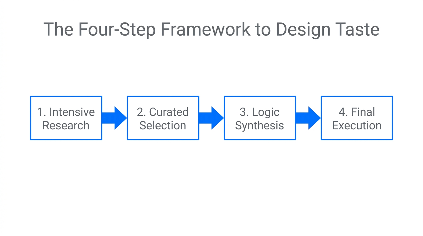
Good taste isn't something you're born with; it’s a muscle you build. If you want your brand to command 2026 prices, you must follow this four-step process to refine your visual language.
Step 1: Decide What You Want to Say
Identity comes first. Are you the 'rugged, hard-working' brand (Workwear style)? Or are you the 'refined, elite' brand (Ivy style)? Your design must speak the language of your audience. If you are targeting blue-collar business owners, your design should feel functional and sturdy. If you're targeting CFOs, it should feel like old money—stable, traditional, and understated.
Step 2: Blindly Copy the Winners
In music, you learn guitar by playing 'Jingle Bells,' not by writing an original symphony. In design, the fastest way to learn 'texture' is copywork. Find 10 websites you admire (e.g., Stripe, Apple, or Linear) and recreate them pixel-by-pixel in Figma. You will start to notice why a button is 12 pixels from the text instead of 10. You are learning the texture of greatness.
Step 3: Learn the Rules Underneath
Once you've copied, ask why. Read about the Gutenberg Diagram and why line spacing from the 1500s still dictates how we read web pages today. Understand why the Swiss used specific grids to create neutrality. Tools like TikTok Ads Manager reward creators who understand visual hooks—learning the 'rules' of engagement is how you lower your CAC.
Step 4: Become an Archivist
Stop chasing 2026 design trends. Most trends are fleeting and 'cheap.' Instead, study history. Look at 1960s Motown records, 1950s Braun electronics, or 1920s architecture. By digging through what was already great in the past, you can create a timeless brand that survives the volatility of the AI era. Platforms like Stormy AI streamline this by helping you find creators who already embody this high-level 'taste' for your campaigns.
"Great taste is just good taste that knows when to break the rules. But you can't break the rules until you have mastered them as an archivist."Why Tasteful GTM Assets Lower Your CAC
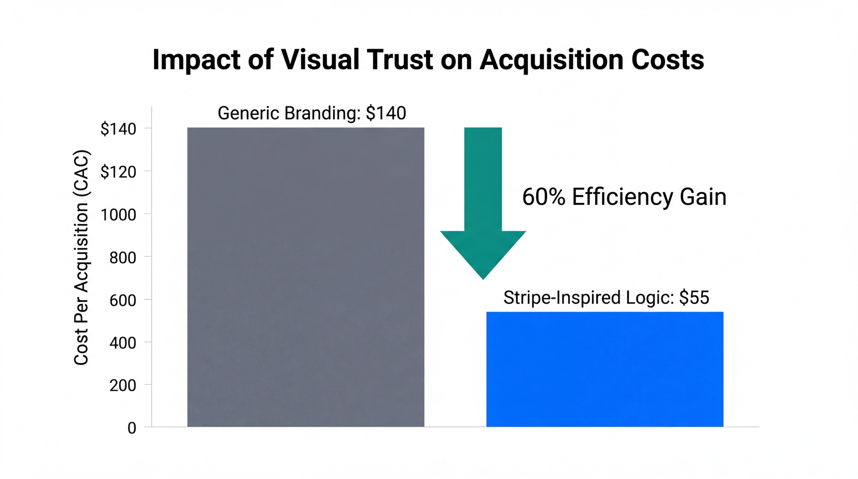
In a world where everyone is using the same AI prompts, the brand that wins is the one that looks the most trustworthy. Higher visual quality leads to higher conversion rates, which directly lowers your Customer Acquisition Cost (CAC). When your ads on Google Ads lead to a landing page that feels like a 'Stripe-level' experience, your cost-per-lead drops because the 'trust gap' has been bridged instantly.
Furthermore, managing these relationships requires a sophisticated stack. Pair your refined design with a Creator CRM to track collaborations. By using Stormy AI, you can source influencers who match your brand's specific 'Ivy' or 'Workwear' aesthetic, ensuring that every piece of User-Generated Content (UGC) reinforces your premium identity rather than diluting it.
| Strategy Phase | The 'Functional' Route | The 'Tasteful' Route |
|---|---|---|
| Sourcing | Mass-emailing any creator | Using Stormy AI to find creators with 'Good Taste' |
| Creative | Generic AI-generated templates | Custom grid-based layouts based on Swiss principles |
| Outreach | Generic 'Collab?' DMs | Personalized, identity-driven email sequences |
| Analytics | Looking only at clicks | Monitoring 'Visual Authority' and long-term brand equity |
The Future of GTM is Aesthetic Authority
As we navigate 2026, the brands that thrive will be those that realize design is not 'decorating'—it is communication. By following the 4-step process of deciding your identity, copying the masters, learning the rules, and studying history, you can develop the 'Good Taste' necessary to win in a crowded market.
Building high converting landing pages in 2026 requires more than just a call-to-action; it requires a commitment to visual excellence. Whether you are launching a new SaaS product or scaling a mobile app via Apple Search Ads, remember that your aesthetic is your silent salesman. Invest in your 'taste' today, and your soul—and your wallet—will thank you.