In the hyper-competitive mobile landscape of 2026, the barrier to entry for building an app has effectively vanished. With AI tools enabling solo developers to ship robust products in a weekend, the market is flooded with functional but forgettable software. The real challenge isn't building a tool; it's building a habit. If you want to move beyond the 24-hour churn cycle, you need more than just a clean UI—you need a "vibe." Success today is reserved for vibe-coded mobile apps that prioritize sensory feedback, personality, and deep integration into the user's daily workflow. By mastering mobile app retention through lock screen widgets, subtle haptic feedback, and custom illustrations, you can turn a utility tool into an indispensable companion.
The Vibe-Coded Advantage: Why Standing Out is the Only Strategy
The app market is currently seeing a massive surge in solo builders generating life-changing incomes—anywhere from $10k to $100k a month. However, the common thread among these successes isn't just the niche they occupy; it's that they stand out visually and experientially. As 2026 approaches, the standard for what makes an app "premium" has shifted. Users can now intuitively spot a "lazy" AI-generated app—it feels static, generic, and lifeless. To combat this, developers are turning to high-fidelity interactions and animations to create a sense of life within the software.
Take, for instance, the evolution of calorie tracking. While there are thousands of these apps on the App Store, a recent project called Amy took a different approach. By blending the simplicity of Apple Notes with advanced AI, the developer created a viral sensation on X (formerly Twitter). The secret wasn't just the AI logic; it was the 6-hour polish phase where animations like gradient transitions, subtle bounciness, and custom loading states were added. These details matter because they signal to the user that the app is high-quality and cared for, which is a fundamental pillar of user experience optimization.
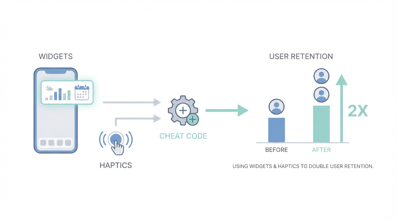
The Lock Screen Hack: The Ultimate Cheat Code for DAU
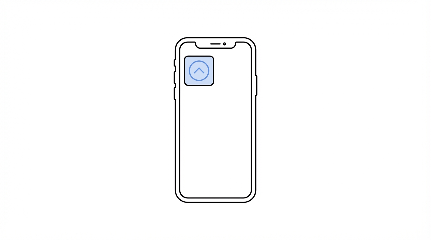
If you want to dominate app engagement strategies, you have to win the battle for real estate. The most valuable territory on a smartphone isn't the home screen—it's the lock screen. Apple only allows a maximum of four small widget slots on a user's lock screen. If your app occupies one of those positions, you have essentially bypassed the notification filter. A user looks at their lock screen roughly 150 times a day; every time they do, they are greeted by your app's presence.
Implementing iOS widget design is a retention "cheat code" because it creates a constant reminder of the app's value. For a daily planning app like Ellie or a budgeting tool like Luna, adding a widget that shows remaining tasks or daily spending can double retention rates. The psychological shift is massive: the app moves from being a destination the user has to remember to visit, to a persistent stream of useful information. Thanks to modern AI assistants, developing these widgets and even full Apple Watch integrations has been compressed from a week-long struggle to a few hours of work. AI is now exceptionally well-trained on Apple's documentation, meaning there is no longer a technical excuse to skip this feature.
Haptic Feedback: Creating a Physical Connection
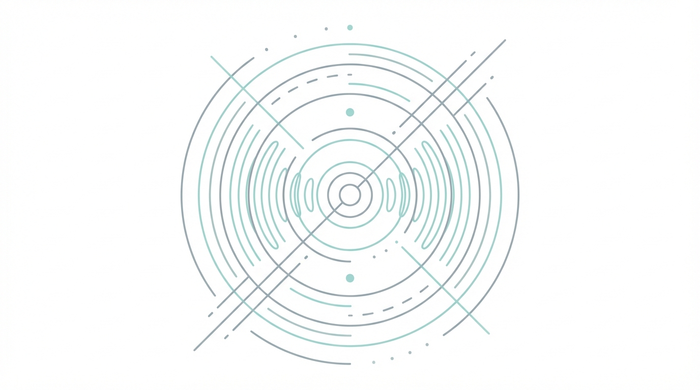
One of the most overlooked aspects of haptic feedback design is how it grounds the digital experience in the physical world. Subtle vibrations—or haptics—provide sensory confirmation for actions. When a user swipes a card in a budgeting app or clicks a checkmark in a task manager, a well-timed haptic pulse creates a feeling of tactile satisfaction. It makes the software feel "heavy" and real rather than just pixels on glass.
Effective haptics should be subtle. You aren't looking for a buzz that shakes the phone; you want a "tap" that mimics the feeling of a physical button. When combined with custom animations, such as Swift Metal-based holographic effects where elements react to the user’s finger movements, the app starts to feel like a toy. This element of play is vital for long-term engagement. If using your app feels good physically, users will subconsciously prefer it over a competitor that offers the same utility but feels static.
Iconography and Typography: The Rules of Consistency
Building user trust begins with visual consistency. A major "tell" of a low-quality app is mismatched iconography and typography. Many developers make the mistake of mixing lined icons with filled icons or using different icon sets across various pages. This creates a subtle cognitive friction that makes the app feel "off" to the user.
For a professional look, stick to one style. Lined icons (where only the outline is visible) often feel more modern and "light," while filled icons are excellent for indicating an active state (like a selected tab). Resources like Heroicons, Font Awesome, and Nucleo provide high-quality, consistent sets that elevate the entire interface. Similarly, typography should follow a clear hierarchy. Using distinct weights and sizes for headers versus subheaders ensures legibility and readability, which are critical for apps that users look at thousands of times a month.
Widget Psychology: The Power of Mascots and Illustrations
Why do apps like Duolingo succeed where others fail? They use mascots and custom illustrations to turn a chore (learning a language) into a relationship. In utility apps like calorie trackers or budgeting tools, the "blank state" or "empty search" screen is a missed opportunity. Instead of a generic "No results found" message, high-performing apps use mascots like "Lily the Ghost" to add personality. This makes the tool feel like a companion rather than a spreadsheet.
AI has revolutionized the creation of these assets. You can now use tools like Midjourney or DALL-E 3 to generate infinite iterations of a character. A pro tip is to commission an artist for a single hand-drawn mascot and then use that as a reference image for AI to generate various poses and expressions. You can even use Midjourney to animate static characters, creating a looping splash screen that looks significantly more premium than a static logo. This level of polish is what users remember and what they show their friends.
The App Growth Playbook: How to Execute
Step 1: Audit Your Interactions
Record your screen while using your app and slow it down. If transitions are instant and static, you are losing users to "vibe-coded" competitors. Use AI tools to prompt for "bouncy" page transitions and custom loading animations. Apps that feel fluid have a higher perceived value on platforms like Meta Ads and TikTok.
Step 2: Secure Your Real Estate
Build a lock screen and home screen widget immediately. Use the widgets to surface the single most important piece of data your user needs. If you're a fitness app, show the step count; if you're a budget app, show the remaining daily allowance. Keep the design minimal but incorporate your brand’s unique illustrations.
Step 3: Source High-Quality UGC
Once your app has this high-level polish, you need to show it off. Static screenshots don't do justice to haptic-heavy, animated interfaces. You need video content. Tools like Stormy AI can help source and manage UGC creators who can record high-quality demos of your app in action. These creators can showcase the "feel" of the interactions, which is your primary selling point.
Step 4: Refine the First Impression
Your App Store screenshots are your "title and thumbnail." If they look like a default template, users won't even get to experience your widgets. Study curated galleries like Mobbin or 60fps to see how top-tier apps present their features. Your screenshots should tell a story, not just list features.
Conclusion: The Era of the Smart Builder
We are entering an era where the technical "how" of building an app is secondary to the creative "what." As development speed increases, the competitive moat for mobile apps shifts toward user experience optimization and emotional connection. By focusing on the details—the bounce of a page transition, the subtle tap of haptic feedback, and the persistent utility of a lock screen widget—you can double your mobile app retention and build a sustainable, cash-flowing product. The tools are available, the AI is ready, and the real estate on the user's lock screen is waiting for you to claim it. Stop building static tools; start building vibes.